Tips for Graphic Designers
From Printers to Graphic Designers
Designing for print is different than designing for web.
This page is currently under construction. Remember to check back for more!
Things to Consider
When preparing designs for print, there are a few things to keep in mind.
The goal of your print ready files should be being reliable and predictable. Print-Ready PDFs save time, money, and aggravation for everyone involved.
We will be covering:
- Bleed & safe areas
- Font issues
- Color Space
- Vector vs Bitmap Graphics
Remember, production isn't perfect. Paper moves and 'bounces' going through the machines. In order to ensure the most accurate print, we need bleed and crop marks. Luckily for you, you can access bleed and safe area templates, right on our website and for free!
Navigate to our template list here and find the product you're looking for. Once you've found your product, click on it. This will reveal a full list of available templates. You can download them in JPG or EPS formats for use in Illustrator.

The red line on the templates indicate where your product will be cut. The blue line is the safety line. Anything inside the blue line will not be cut. All important information and design should be inside the blue line. The green lines are where your product will be folded if applicable.
Once you have completed your design, in order to add bleed and crop marks to the finished PDF, follow these steps:
- Make the artboard/canvas the size of your finished product. Allow the background art to extend beyond the artboard/canvas.
- Export your design to a PDF format.
- In the PDF settings, go to "Marks and Bleed" in Illustrator or "Prepress" in Corel
- Select the options for trim/crop marks.
- Set an appropriate bleed amount (minimum 1/8" or .125" on most projects).
- Save your PDF after you've selected all the appropriate settings for a Print-Ready PDF.
Font Issues
Fonts don't always translate to print properly. Fonts are technically little programs, a series of instructions of how to draw letters and their spacings. They can become corrupted. They may look fine on your screen and on desktop printers, but they can raster funny or, in some cases, not at all. Play it safe and convert your fonts to outlines/curves.
In both Illustrator and Corel, you can right click on your text, directly on your artboard/canvas and convert it to curves/outlines. This will ensure that your text prints properly and doesn't get corrupted.
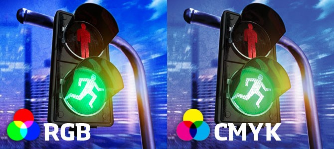
Color Space
There are two common color profiles that most graphic designers use, RGB or CYMK
RGB is an additive color profile that is mainly used in video and for screens. Whereas CYMK is a subtractive color profile used in print media. Therefore, when designing something for print, you'll need to design in CYMK or convert it after. However, it will be more consistent and efficient to simply design in CYMK.
RGB will provide more vibrant colors on the screen, but will not print that way. Most printers cannot print RGB colors and will convert your design to CYMK regardless.
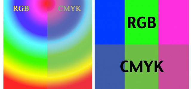
Neglecting to do the color conversion before printing, the printer will try to convert using its own software, generally referred to as a RIP and they don't usually do a good job. Notice the dull color conversation.
Expect the CYMK image to be less vibrant than the RGB version. But it will not be nearly as dull if you allow the RIP to do the conversion.
It's a pretty simple process to convert your designs to the proper color profile. Just follow these steps:
- In your PDF save settings, go to "Output" in Illustrator or "Color" in Corel.
- In Illustrator, select the "Convert to Destination" in the Color Conversation option, "U.S. Web Coated (SWOP) v2" in the Destination and "Include Destination Profiles" in Profile Inclusion. In Corel, simply select "Use color proof settings" and embed the "U.S. Web Coated (SWOP) v2"
- Save your PDF after you're selected all the appropriate settings for a Print-Ready PDF.
You can also convert colors directly in Acrobat Pro and it will be a little more accurate.
- Open your PDF in Acrobat and go to Tools, followed by "Convert Colors."
- Select "Convert Colors to Output Intent"
- Select "U.S. Web Coated (SWOP) v2" as your profile
- Select "Preserve Black."
- Remember to select all pages.
A few more words of advice.
- Linked items don't seem to always convert properly when saving a PDF. Always convert colors in Acrobat as a precaution.
- Black RGB (r0 g0 b0) converts into a 4-color black and the black channel isn't 100%. Manually convert everything expect images into the desired CYMK (or spot color) value before making the PDF. When you want a black font color, it is much sharper if you have 100% black and not a 4-color rich black.
- If your job is printed in spot color (PMS), do not convert to CYMK. Work in a way that the job can easily be color separated. It could be costly for the printer to unCYMK your files. If you're unsure if you should convert your color profiles, you can always ask your printer what they need.
Vector vs Bitmap Graphics
Both image formats are important. However, the biggest problems arise when a vector logo (for example) will result in a better quality job, but the only thing provided is a low quality bitmap. Usually, you'll want to provide your printer with both the bitmap and vector file, just to be safe.
While the ideal lower resolution for a color photo is 300 dpi, line art will be the smoothest if you save it in at least 800 dip.
Photoshop is great for editing bitmaps, but it's cumbersome to use for print layouts. Remember the goal! It's more time consuming and aggravating to use Photoshop as a print program than Corel, or even Illustrator.
This page is continually looking for topics to add that would be helpful to our customers and their graphic designers. If you have any topics that you'd like us to cover, please contact us at artist@printingdiscounters.com